What Jewelry Are You Wearing Now?
What jewelry are you wearing now? (Are you asking for anything along those lines for presents, or keeping an eye out for post-holiday sales?)
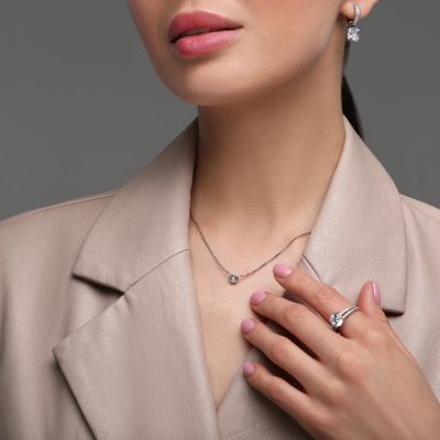
What jewelry are you wearing now? (Are you asking for anything along those lines for presents, or keeping an eye out for post-holiday sales?)

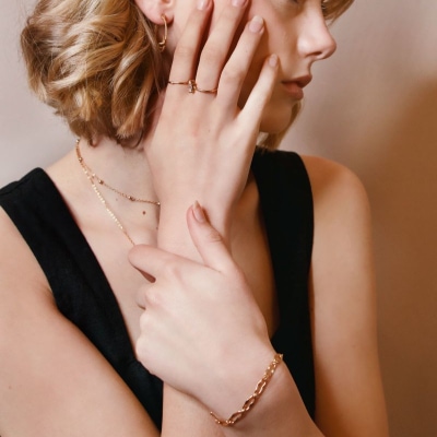
What jewelry do you wear to the office? Which are your favorite pieces on repeat, and which pieces do you think you should wear more?
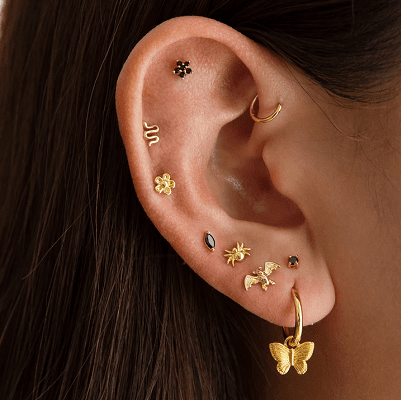
What are your thoughts on multiple earlobe and cartilage piercings at the office, readers? Do you have them yourself? Would someone with them be hired in your workplace?
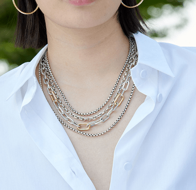
Readers, what kind of necklaces are you wearing right now at the office and on Zoom? I went on a hunt for statement necklaces for work…

These are all my favorite ways to store jewelry — what are yours?
Notifications
